If you’re reading this, you’re probably some level of indie game developer who’s feeling a bit daunted at everything you hear about Steam. Thousands of games per year. Players driven away by unprofessional pages. Expensive assets needed to make it good. Well, I’m Buddy, the Head of Publishing for Akupara Games, and I’ve spent a ton of time obsessing over screenshots, trailers and copy. Today, I’m writing that obsession up into a blog for you to peruse. Insofar as this is my little professional niche, we’re going to answer the question: How does a dedicated professional make a Steam Store page?

Pillars
At the end of the day, everything that follows from here will come from the game. The product. Your store page is there to explain to someone what the game is in as little time as humanly possible, and that requires boiling down that product to its very essence. From the marketing perspective, we call this the game’s pillars– the ingredients that go into making the game what it is.
Those ingredients are going to stretch over all aspects of it. What kinds of mechanics does it have? What genre? What’s the story like? Is the thematic, emotional storytelling the most important part of the game or the complicated, Swiss watch mechanics? And even more than that, what pillars are more important than others? Which pillars are present in every second of gameplay and which pillars are the tiniest garnish that ties the whole thing together. Before you begin making the Steam page, you need to know how to define all of that.
In practical terms, I make four pillars, I give them a cute name, and then, I list them out in order. And they’re so impactful to the process of making the store page that, for a number of them, you can just see the pillars listed right out in the store copy. On the store page for Cabernet, Higher Society, Dusk to Dawn, Unleash Your Fangs, and Sacrifice or Sacrilege are the game’s pillars. They’re just one to one on the features list. But we’ll talk a little more about that down the line.
Comparables
Before you even touch a pixel of your store page or write a single line of copy, you need to know who your neighbors are in the digital storefront. We always start our process by looking at “comparables”– games that share our genre, our artistic vibe, or our core mechanics. My comparables are divvied up into two sections: core comparables and secondary comparables. In total, I’m looking for ten total comparables that I can come back to over and over again throughout a marketing campaign.
The core comparables are the games that are closest to mine. If I do that thing of describing a game as “it’s like [POPULAR GAME 1] meets [POPULAR GAME 2]”, I’m typically looking at both of those games as core comparables and then, I’m trying to find anybody else who’s ever attempted that genre fusion and rope them in as well. The core comparables are your lighthouse in the fog. When in doubt, look here, see how they handled things. What tags do they prioritize? What do they feature in their screenshots and gifs? These pages are the ones that I steal from whenever I need guidance or reassurance. At the end of the day, I find three core comparables for my projects, but that’s not a hard and fast number. They’ll come back into play a little bit later on.
The secondary comparables are the games that aren’t so one to one to your title, but your title definitely has aspects of them. Maybe the world design is a little similar. Maybe they’re both post-apocalyptic. Maybe they just share a simple feature, like pixel graphics or twin-stick aiming. For these titles, you want to go far and wide and find singular, specific things that you like in these pages. Maybe they have a good trailer. Maybe the way they ordered their screenshots inspired you. Maybe their gifs are something you want to refer to later. It’s about finding the off-the-beaten-path inspiration, clicking through “More Like This” on your core comparables until you find some game you’ve never heard of that does something interesting or clever. Go far and wide for these. Again, not a hard and fast number, but I use seven secondary comparables.
Key Art and Capsule Art
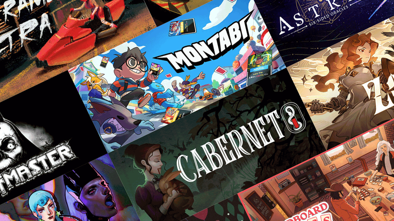
I’m a trailer guy at heart, but even I recognize this simple truth: Key art will always be the most important asset you ever make for your game. It’s the very first thing a player sees while scrolling at the speed of light through a massive Steam summer sale, and you have exactly half a second to make a lasting impression. Key art is used for a couple of things: It’s right above your short description, it’s what shows up in search, it’s what gets placed in sale pages. One piece of art will need to be refactored a bunch of times to meet all those individual needs.
But at the highest possible level, let’s talk about what good key art is. When I’m evaluating key art, I care about three things: Does it communicate genre? Does it communicate art style? Does it communicate the emotional core of the game? If it’s a shooter, I better see a gun. If it’s a creature collector, show me as many of your monsters as you can. If it’s a party-based RPG, show me my party. The art style doesn’t have to be 1:1 but it should be close. Pixel art games get pixel art key art. But maybe the hardest one of these is the emotional core. The vibes. Does looking at the key art put me in the right emotional state of the game? If it’s horror, then spook me. If it’s heroic, inspire me. If it’s cozy, relax me. And for the love of god, make your logo as legible as possible. You’d lose your mind seeing the number of pages coming across my desk with gobbledygook logos.
Tags
OK, tags seem super simple but they’re the lifeblood of Steam discoverability. So much of doing business on Steam is decoding the mystery of Steam’s algorithm and tags are exactly how it figures out who to show your game to. But more importantly than algorithmic wizardry, tags are how you set player expectations.
The rule here is really simple: Find your core comparables. You know what three games ought to show up in your “More Like This” section down at the bottom of your Steam page. The whole ballgame is just rearranging tags until you find those games. I like to do this by measuring the tags themselves directly. What tags do all three of your core comparables share? What orders do they get placed in? What are the first four tags for each of them? A little trial and error and you’ll get exactly what you need. Like I said, your core comparables are your lighthouse in the fog.
Screenshots
Screenshots seem easy. Boot up the game, take a hundred screenshots, look for the ones that jump out at you and throw ’em up there. But that’s about ten percent of the work that needs to get done. The other ninety percent can be summed up in one word: Contrast.
The total number of screenshots you want is ten. You need one screenshot that explains your game in its most distilled, basic state– whatever your number one pillar is, make this your prime screenshot. You’ll need three more that fill out the rest of your core gameplay pillars. The first four screenshots make a little mouseover gif when you hover over them in Steam– you want someone to be able to watch that not-really-a-gif and know what the gameplay and genre are at a minimum. Finally, you need six more filling in all the little nooks and crannies to your game’s design. Show an end game boss fight. Show alternate character playstyles. Show menus and UI. Show alternate game modes. This stuff goes in the back six.
And then, you want to place those screenshots in an order that creates, say it with me, contrast. Players don’t look at screenshots in a vacuum. They click through one at a time, in the order you give them. You need one screenshot to have contrast with the next screenshot, so that everyone can detect the differences between them. If your game is a twin-stick shooter and you have two screenshots in a row of the same level next to each other, that makes your game feel small and thin. If you put two screenshots with different characters, different enemies, different level design next to each other? That makes your game feel expansive– though, the golden rule here really is to be able to scroll through every screenshot and see a completely different framing for each one.
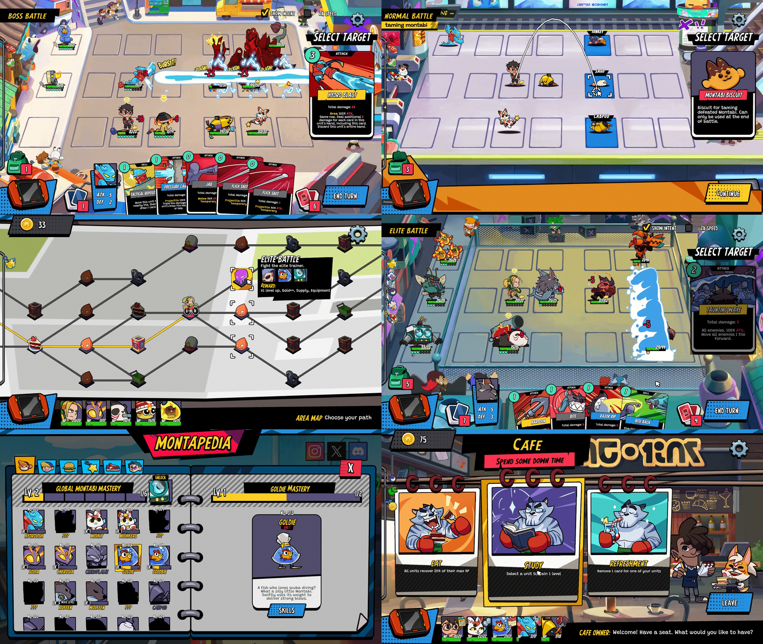
That gif up at the top of this section shows all ten screenshots from Montabi in a row. See how there’s no place where the battle grid comes up twice in a row? Golden rule.
Trailers
The very first thing anyone will see of your game is your key art or capsule art. That’s what they click on to get to your page. But the first thing they see on that page itself is going to be your trailer and Steam users want one thing from that trailer: They want short clips of uninterrupted gameplay. That’s really it.
Internally at Akupara, we literally call this trailer the “Glorified Gif,” which for the record is a term we stole from Derek Lieu. The big, flashy, fancy trailer, the kind of trailer that gets tons of YouTube views and goes viral on social media just doesn’t work on a Steam page. Steam users want clear, definitive, unfiltered gameplay. They don’t want crazy camera angles. They don’t want cinematic cutscenes. They want to see what sitting and playing the game will look like. And, importantly, they don’t want to listen to it! If you have a shot in a trailer that works because you can hear the amazing sound design, I’m sorry– nobody unmutes these. The trailer has to work just on its visuals. This is the first thing that people want to see right when a page loads. Give it to them.
For the other trailers, the fancy ones, I drop those in the second position on my Steam pages, typically the last one that I just put out. Players really commonly click past these straight into screenshots, and that’s fine. If they want to watch the big, over the top cinematic, excellent. It’s right in that second position for them.

Copy
Finally, after all that stuff above the fold, we get to the words. The short description and the more robust “About This Game” section. Here is our golden rule: find powerful verbs. What is a player doing? When they sit with the game on and their controller in their hands, what does that serve as a conduit for? “Smash your enemies,” “Build your dream tavern,” “Unravel a cosmic mystery.” Speak directly to the player, explaining to them like you might explain to a friend what your favorite new game is and why it’s cool.
And by the way, this is where pillars return to our pipeline. You know how, in that top paragraph, I referenced using game pillars in the store copy for Cabernet? That’s a practice that extends across most of our catalogue. Features are excellent at quickly and concisely explaining the concept of a game to players. A headline. One sentence. An elevator pitch. At the end of the day, players are looking to use your Steam page to define what the game is for themselves. If your pillars are your ingredients, they can be your features and explain what your game is and how it plays. That’s just how this works.
Copy should always feature what makes your game both familiar and innovative. You want to relate your game to other gameplay experiences players might like: talk to them like they’ve played farming sims or roguelikes before. They’ll get it. But you also want to offer them something new to do, something they’ve never experienced. Maybe they’ve never experienced a post-apocalyptic creature collector, so the setting is your innovation. Maybe you have some new gameplay mode that’s unique to you– explain that! Whatever it is, you need to relate to players’ current experiences and then, sell them on what makes your game unique. For the record, because this is pretty easy, I also recommend localizing store pages to the languages in your game. If you’re coming to China, don’t force Chinese players to read an English Steam page. Localize the copy. It’s one of the best ways we can force the Steam algorithm to focus on our page.
Then, finally, thread some gifs in the long description! You have a lot of room to play with down at the bottom of the page. Write a paragraph, then show them a gif of the thing you just described in that paragraph. Using visuals to explain the concepts people are reading will separate your store page from the amateur stuff in an instant. Trust me.
Analytics
Alright, last section, I promise. You might be wondering: “Buddy, how do I know if I’m doing this stuff right? If I’m doing a good job?” Well, the easiest way to diagnose that are the analytics in Steam’s backend. I’ll probably end up doing a bigger deep dive into this in the future, but there are three numbers back there that show the efficacy of your page. First, your impressions. This is “how many people saw your capsule art.” Next, your visits. This is “how many people clicked on your capsule art and hit the page.” Finally, your wishlists. I’m gonna just venture a guess that you know what this one is– but the point is the flow. Don’t just measure wishlists, measure wishlists against visits. Visits against impressions.
The formula here is actually pretty simple. If you want to influence impressions, change your tags. If you want to influence visits, change your key art. If you want to influence your wishlists, change everything else.
Anyway, that’s about it from me. If you want to talk shop, share your own store page, or just ask for some advice on contrasting screenshots, come hang out with us in the Akupara Games Discord! We love chatting with fellow devs and players alike, and we’d love to see what you’re working on. And as ever, if you’re looking for a publisher, feel free to pitch your project to us here!